La Salle Worldwide IDENTITY MANUAL Scroll Down LA SALLE WORLDWIDE 2021 Identity Manual The 2021 Identity Manual seeks to enhance the corporate image, to enrich its graphic identity, and to promote a clear and coherent use of it in all Districts in relation to other regional or national brands.

A strong corporate brand will favour an international vision of the brand and will complement the tradition and strength of local brands, making the diversity of cultural richness bring unity to our image worldwide.
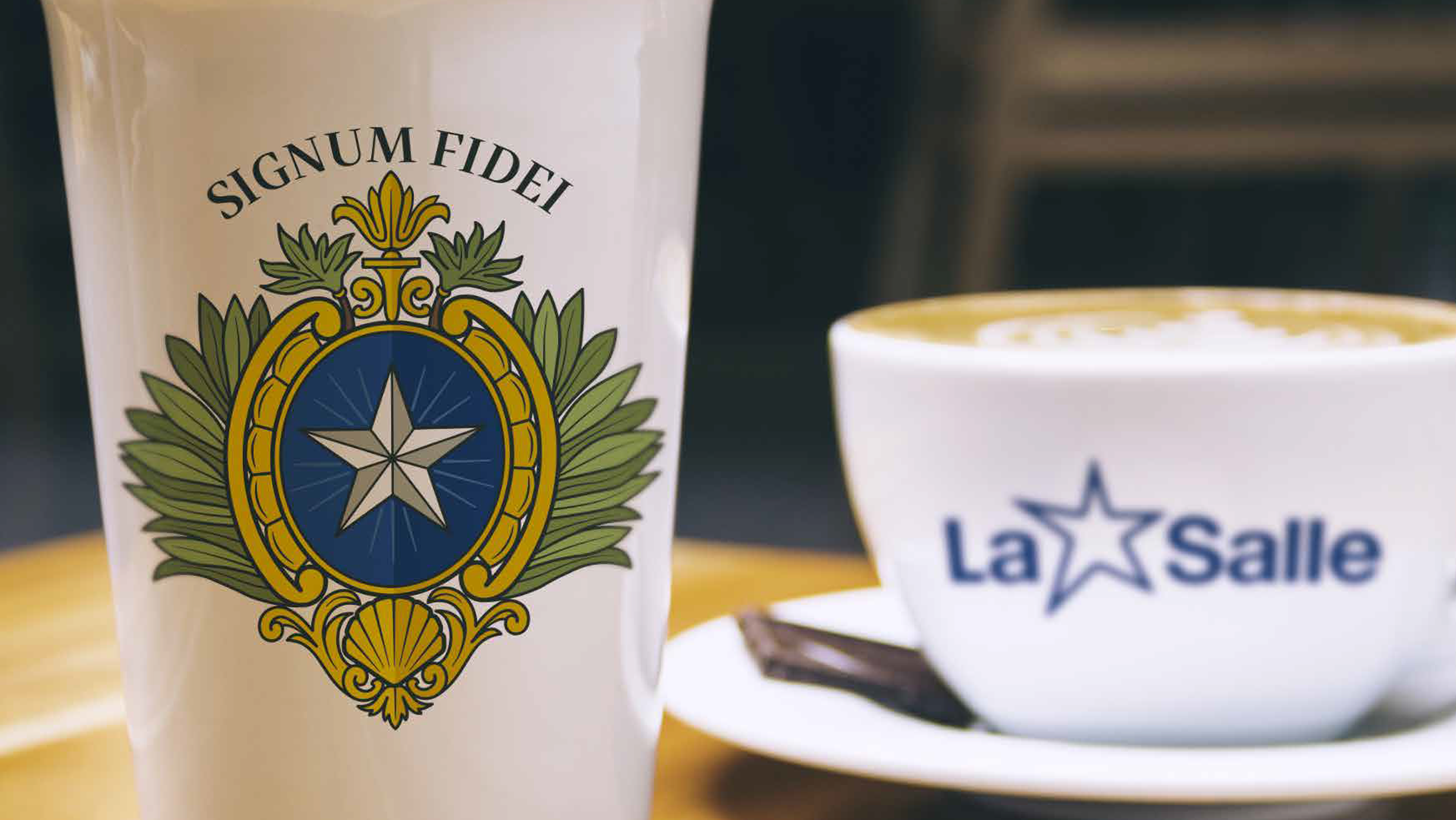
SIGNUM FIDEI WITH TYPOGRAPHY After a review of some of the Institute's archives, the Signum Fidei was completely redrawn and the possibility of accompanying it with typography was included to reinforce the identification of the Brothers at ecclesial and civil levels. Likewise, versions were created for Regions, Districts, Delegations, cities and countries. CORPORATE BRAND The corporate brand of the Lasallian Educational Mission (La [star] Salle) includes changes in the proportions of some of the elements that make up the brand, and the points of the star were rounded. GEOGRAPHICAL LOCATION EXTENDED GEOGRAPHICAL
LOCATION
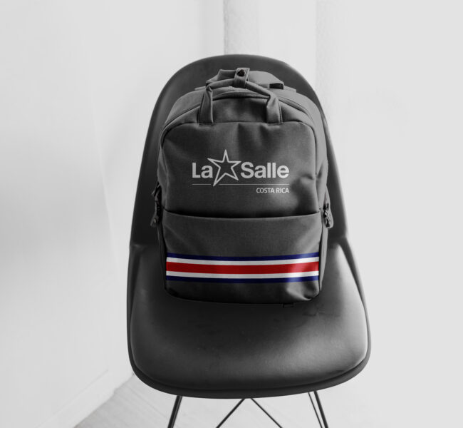
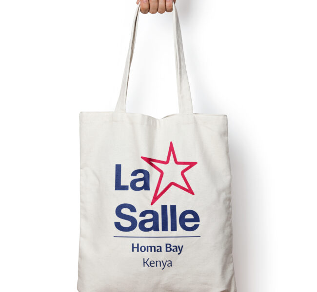
Both the Signum Fidei and the corporate brand may be used to locate ministries in the same country or Region. This represents the possibility of extending their use outside the administrative denominations (Regions, Districts, Delegations) and when circumstances require it.
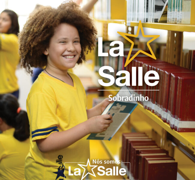
NEW STRATEGY OF BELONGING To facilitate the use of local logos together with the corporate brand, the name "We are La Salle" is included for internal communications, and "Member of La Salle" for external communications, which broadens the possibilities of use in different pieces, both digital and printed. COBRANDING APPROACH TO COBRANDING The strategy of belonging opens up the possibility of harmonising the use of the local logos or brands with the international brand; using the customised international brand, redesigning some local brands, as well as taking advantage of the new colour palette for the redesigns of the graphic aspects in the current uses of the local brands.

The DNA Of The Institute's Identity

Signum Fidei
The new seal

The assignment of updating the graphic identity of an Institute with more than 300 years of history involved a search in archives and sources in order to understand the motivations, intentions and logics from which the first Brothers worked to choose the visual elements that made up the first seal and to understand its historical evolution.

This entailed an exercise of interpretation and association between some of the elements that make up the Signum Fidei, since the materials consulted do not provide many details that give an account of the previous transformations of the brand, but only of the decisions taken in the General Chapters.

Corporate Brand of the Lasallian Educational Mission
Lasallian Educational Mission

A GLOBAL BRAND, POSITIONED AND APPROPRIATED BY THE LASALLIAN FAMILY

This exercise has consisted of updating the logo (2010) that identifies thousands of the Institute’s ministries around the world; it complements a new strategy of institutional identity of cobranding that is characterised by the inclusion of new graphic elements and the words: “Somos”, “We are” and “Nous sommes”.

In this sense, new elements appear that will accompany the brand according to the different uses it is given: squares that frame while leaving open spaces to connote the openness of the Lasallian spirit, and new versions in standardised colours with a wide and dynamic chromatic palette.

The Indivisa Font typeface family was also implemented as part of the new elements accompanying the La Salle brand to create new uses, especially for digital media that require square or round images in some cases.

In short, the new look of the brand corresponds to a visual development that respects the history and background of the logo, standardising each of the elements that make up the brand and expanding both the uses and the graphic pieces.

Colour palette One of the most characteristic features of the La Salle Institute is the multicultural nature of the entire community which makes it up and which is the living reflection of the Lasallian values. For this reason, the new strategy needs a chromatic palette rich in diverse and combinable tones so that each establishment can appropriate the colours they feel more identified with.
The chromatic palette is divided into four parts.
Colour palette INSTITUTIONAL The first is the institutional palette, which has mainly institutional blue and grey (75% black). Colour palette MULTICULTURAL The second is the multicultural palette in which nine light colours and nine darker analogues are shown to complement the institutional palette. Colour palette GLOBAL ETHNIC The third is a palette of recommended combinations, called global ethnic because it visually shows the possible mixtures. Here you will find combinations with the institutional blue, between colours of the same tone and between various colours. Colour palette ENERGY Finally, the energy palette is intended to illustrate the possibility of creating gradients by mixing the colours of the palette with each other.

Other brands

A versatile and adaptable structure

One of the great contributions of the Institute’s corporate image strategy is the possibility of applying the brand to the development of new related logos*. Just as local brands can be created for each of the ministries, this type of logo can be generated, such as the one designed for La Salle Foundation which is the legal instrument of the Institute’s Secretariat of Solidarity and Development.

*The creation of a brand using this possibility will have to be authorized by the Institute’s Service of Communication and Technology.

INTRO TYPOGRAPHY In a diverse world, the “Indivisa Font” typeface family is a unifying element that allows each person or ministry to recognize themselves as part of an international organization while, at the same time celebrating diversity.

With a careful balance between functionality and personality, the typographic system covers all the needs for institutional communication through a quality graphic voice, in which the Lasallian spirit converges in a context of contemporary use.
This typeface was designed in Mexico and is available free of charge to all Lasallians worldwide at: www.indivisafont.org
Brand Applications
Online and Offline Uses
IDENTITY MANUAL VERSION 2021 - La Salle Worldwide
The communications offices of the Regions, Districts, Delegations and Lasallian educational ministries can request the Identity Manual (PDF) and the files necessary for its implementation by e-mail from the Institute's Communications and Technology Service: comunicazione@lasalle.org
background